U.S. Air Force · Platform One
Designing an AI assistant projected to cut support tickets by 40%
Platform One is the Air Force's flagship software factory, supporting more than 60 Air Force and Joint programs.
But after a rushed rebrand, users couldn't find the answers they needed on its website. Sometimes they couldn't even find how to ask for help. Emergency fixes piled on top of each other, and while they helped in some ways, in others they made things worse.
- ROLE:
- Product Designer, Interface & Conversational UX
- TIMEFRAME:
- 20256 months
- TEAM:
- 1 Designer2 DevelopersSecurity approverProject Manager
- SCOPE:
- Conversational UX flowsComponent & state libraryEscalation & routing logic flowsInterim widget re-skinFull app design
Every answer users needed was already on the site, buried in the docs.
The rebrand shipped fast. High-level marketing copy replaced much of the detail users relied on, and the answers that survived ended up in the documentation, where most visitors never thought to look.
Users who gave up searching had nowhere to go, because the site had no Contact Us form.
Adding one was the first fix, and it was the right call. It also stuck a team built for sales and customer relationships with basic help-desk tickets.

Our "stop the bleeding" fix worked. It also flooded the wrong team.
The Contact Us form gave stuck users a path, and ticket volume climbed immediately. A Customer Success team built for sales and relationships became full-time routers: password resets, emails forwarded between product teams, and a CRM that could not talk to Jira.
The responses were full of PII, so automated analysis was off the table. I pulled random samples (about 150 responses) and coded them by hand: nearly half were simple help-desk asks or information already on the site, and most of the rest belonged to other teams entirely.
Triage was consuming close to a full role's worth of capacity across the four-person team, on tickets none of them were meant to own.
And not every buried answer was routine. One came due mid-incident.
“If I didn’t have to deal with these tickets anymore, I would be so happy I could cry.”
// DURING A LIVE SECURITY EVENT
The documentation existed. He couldn’t find it when it mattered most.
Answer at the point of confusion. Hand off to a human by turn four.
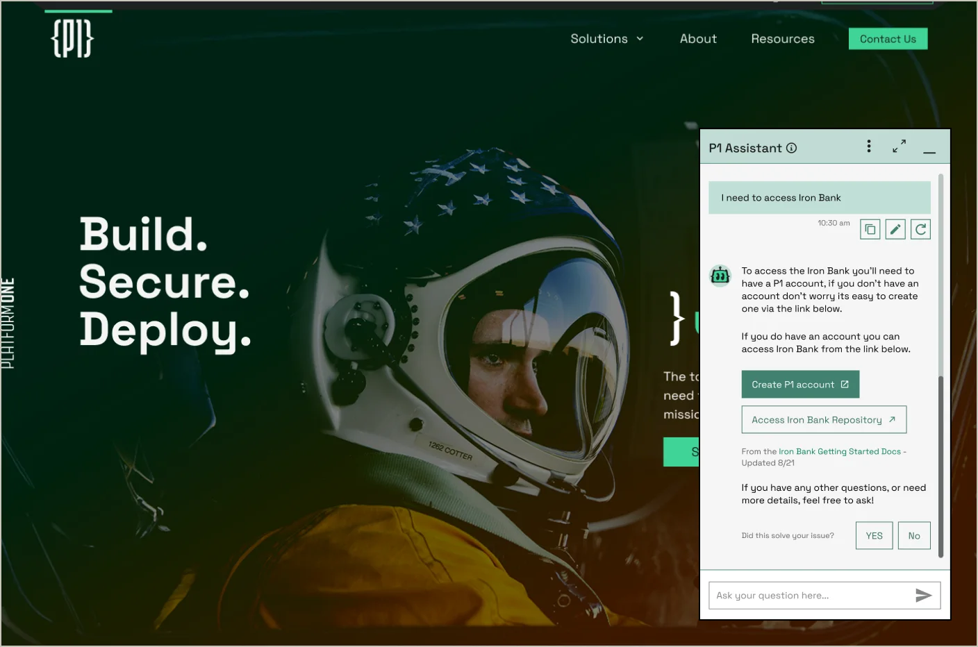
Most of those tickets should never have existed: in the sample audit, nearly half were answers already on the site. The assistant answers at the point of confusion, surfacing sources and suggesting follow-ups.
Why an assistant instead of just fixing the navigation? Deeper IA work was underway, but on a much longer timeline, and earlier band-aid fixes had made things worse. The assistant could ship in months, and it unlocked the budget and infrastructure for the platform's next AI projects.
After two turns without a resolution, a soft CTA offers the help desk or Customer Success, routed by question type. After turn four the CTA becomes a hard one, so no conversation loops. The thresholds are a starting point; every did-this-help answer is data for tuning them.
The routing burden moved from an overworked team to a system.

Every answer shows where it came from.
Sources appear inline with the answer, so a user or an auditor can see what a claim rests on before acting on it. On a DoD platform, an unsourced answer is a liability.
The rule holds when there is nothing to cite. If the assistant has no source for a question, it says so instead of filling the gap, and the handoff path takes over.
Every exchange closes by asking the user whether the answer solved their problem.

The same assistant works two ways, depending on what you need.
General visitors get a lightweight widget on the page they are already reading, with the routing rules above intact.
Developers working in the documentation can expand it to full screen. Different system prompt, code handling, and no handoff prompts, because a debugging session runs long by design and a CTA to Customer Success at turn four would interrupt work rather than unblock it.
The widget was my call. Our developer wanted a coding assistant instead, and he was working without visibility into the ticket and routing problem the widget was built to solve. Rather than argue the tradeoff, I went back to the tickets: bug reports, technical questions, and deep support requests were coming in, less often than the general help asks but consistently. Both modes were justified, so I designed both.

Our developer wanted a coding assistant. Instead of arguing, I went back to the tickets.
One developer meant designing to what he could actually build.
With a single primary developer, I designed to Vuetify's defaults wherever they held and customized only where the default cost users something concrete.
When the team chose a partner's chat widget to launch sooner, I documented the UX gaps and worked with the developer to re-skin and customize it as much as we could. The miss was ours: we brought security in too late for the custom assistant to clear review before launch.
Today the assistant sits in staging. Once we clear the security hurdles, our design and assistant replace the widget.

Projected impact, and what's left to prove
The assistant is in staging. The 40% is the share of the hand-coded sample whose answers already lived on the site. It is a ceiling, and the assistant is built to claim as much of it as it can reach. Customer Success capacity comes back two ways: tickets answered before anyone files them, and the misrouted remainder reaching the right team through routing rather than a person forwarding email.
And the next time a leader needs proof the platform is secure by design, the answer is one question away.
Launch is phased. The assistant goes behind SSO first while the public site completes its Certificate to Field, the DoD security authorization, and the custom front-end replaces the interim widget on the roadmap.
If I ran this again, I would bring security into launch planning from day one. The SSO constraint reshaped our rollout late.


// PROJECTION FROM THE HAND-CODED 150-TICKET SAMPLE — NOT YET A MEASUREMENT

Links
Product Designer engineering intuitive UX for complex DoD, GovTech, and AI systems.
Follow @andrewmarksart for design, vibe coding, the latest AI news, and things I think are cool or interesting.
Connect with me on LinkedIn /in/andrewmarksart/ as I build projects in public on AI agents & the future of UX.
View my public work on GitHub. DM for access to select private AI and UX repositories.
Focused on how humans and AI work together. From secure DoD systems to rapid AI prototyping, I use my background to turn complex data into UX research and design that lets AI systems scale.
Reach me directly: andrew.colin.marks@gmail.com


